On the typically-London overcast morning of September 19, I found my way to the small, tucked-away Nunnery Gallery in East London, and stepped into a room full of community, passion, and craft.
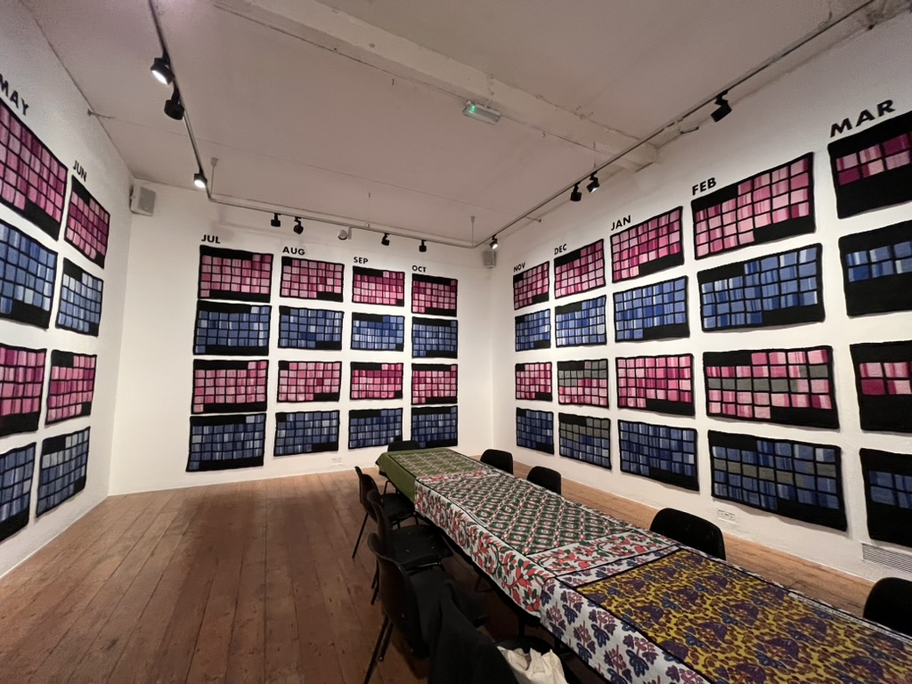
The exhibition Knitting the Air, led by Caroline Murray, brought together 132 knitters from Poplar, Bow, and East London to knit data from two Breathe London Communities sensors in Poplar from 15 March 2023 – 15 March 2024. The pink squares represent fine particulate matter 2.5 (PM2.5) and the blue squares represent nitrogen dioxide (NO2), with darker colors representing higher readings.
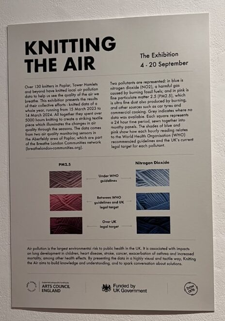
I was there to participate in one of the workshops, knitting data from June and July 2026. As both a knitter and a public policy researcher, I was fascinated by this method of data visualisation and familiarisation. All together, the exhibition represented over 5,000 hours of knitting. Caroline was able to answer any and all questions about the data in fine detail, having become so intimately familiar with this data over the course of three years working on this visualisation. Other knitters there who had worked on the project were also familiar with the data, an impressive feat of public engagement in pollution research. Children who came into the exhibit were able to immediately pick up on patterns and the sheer quantity of days with pollution levels exceeding the UK legal targets. It was clear that this method of data visualisation not only engaged the community that worked on it but also those who might have trouble grasping other visualisation methods (e.g. graphs, charts, etc.) such as children.
However, this wasn’t what had the greatest impact on me. When I sat down to begin knitting, I was given a half-finished square by someone from last week.
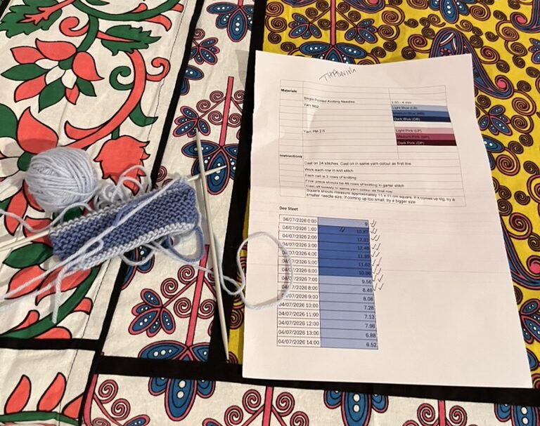
I finished their square, adding my name to the top of the sheet. I then completed two of my own squares. I left a half-finished square of my own behind, for someone to continue the work after I am gone.
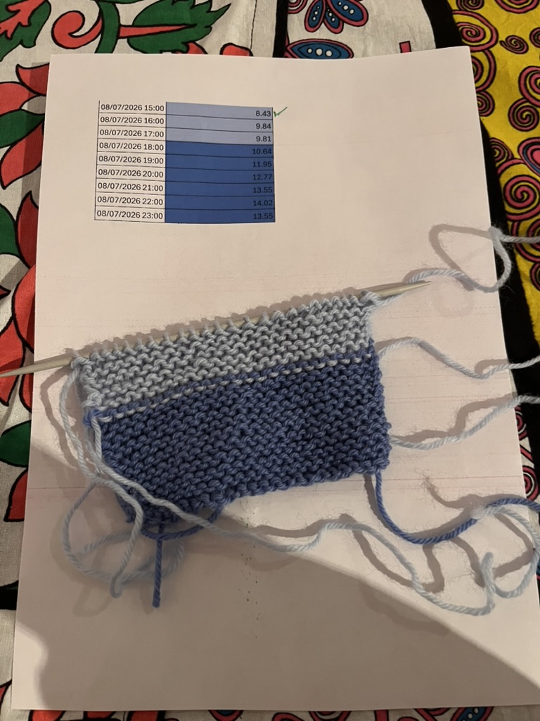
I was surprised by how deeply moving it was to come into an art and advocacy project already in motion, contribute my work, and leave it unfinished for the next person to pick up. It felt deeply communal in a way a lot of research projects don’t. You do your research, write a paper, and move on. But in reality the work never ends. The issues you research don’t stop because you stop looking at them. And I found that these workshops were a perfect way to encapsulate that idea. Yes, there is a finished exhibition. But there is always more work to do, always more data to knit.
It was also moving to be contributing alongside a group of other knitters, talking and giving advice. This project is not just one person’s labor of love but 132 people’s labor of love, and you can feel that when you meet the knitters who participate(d), hear them talk about their experiences with the project, and see them bring more knitters into the fold. One knitter was also an environmental scientist, and she was able to talk further about the data and its effects. Several knitters brought their children to work with them on the project. All of us brought our own personal knitting style to our squares.
At one point, Caroline commented on how one knitter knits through the back loops. She then was able to get up, look around at the squares in the exhibition, and point out squares that that particular knitter had made. She now has a kind of forensic knitting expertise, allowing her to pick out people’s work in the sea of squares. She’s not only intimately familiar with the data, but with the community members who helped visualise it. The community members not only know the data, but can point to their specific work on the project. It felt like being a drop added to the ocean to contribute my own squares. And maybe Caroline will be able to point them out to me later.
To credit the knitters who worked on this project, Caroline knitted a blanket with all of their names.
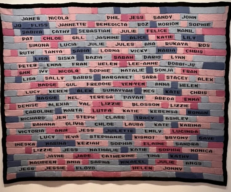
I saw children look up to find their parents’ names, saw people take pictures with their names, and found myself envisioning my own name on a similar blanket one day.
Caroline chose to not only visualise the data but also the people who made the visualisation happen.
Words cannot describe how this experience made me feel. I felt surrounded by community, surrounded by the knowledge that I was part of something bigger than myself, that I was using my personal hobby skills to advance research and policy advocacy I believe in. As I move forward in my public policy career, I will keep this experience close to my heart, and look for opportunities to engage my communities in a labor of love.
To get involved with Knitting the Air, follow the project on Instagram.